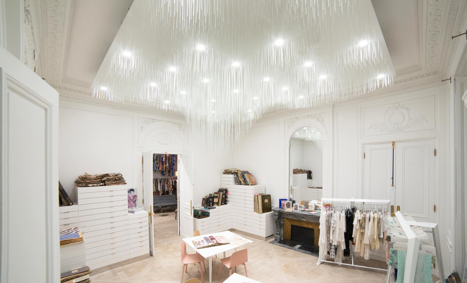
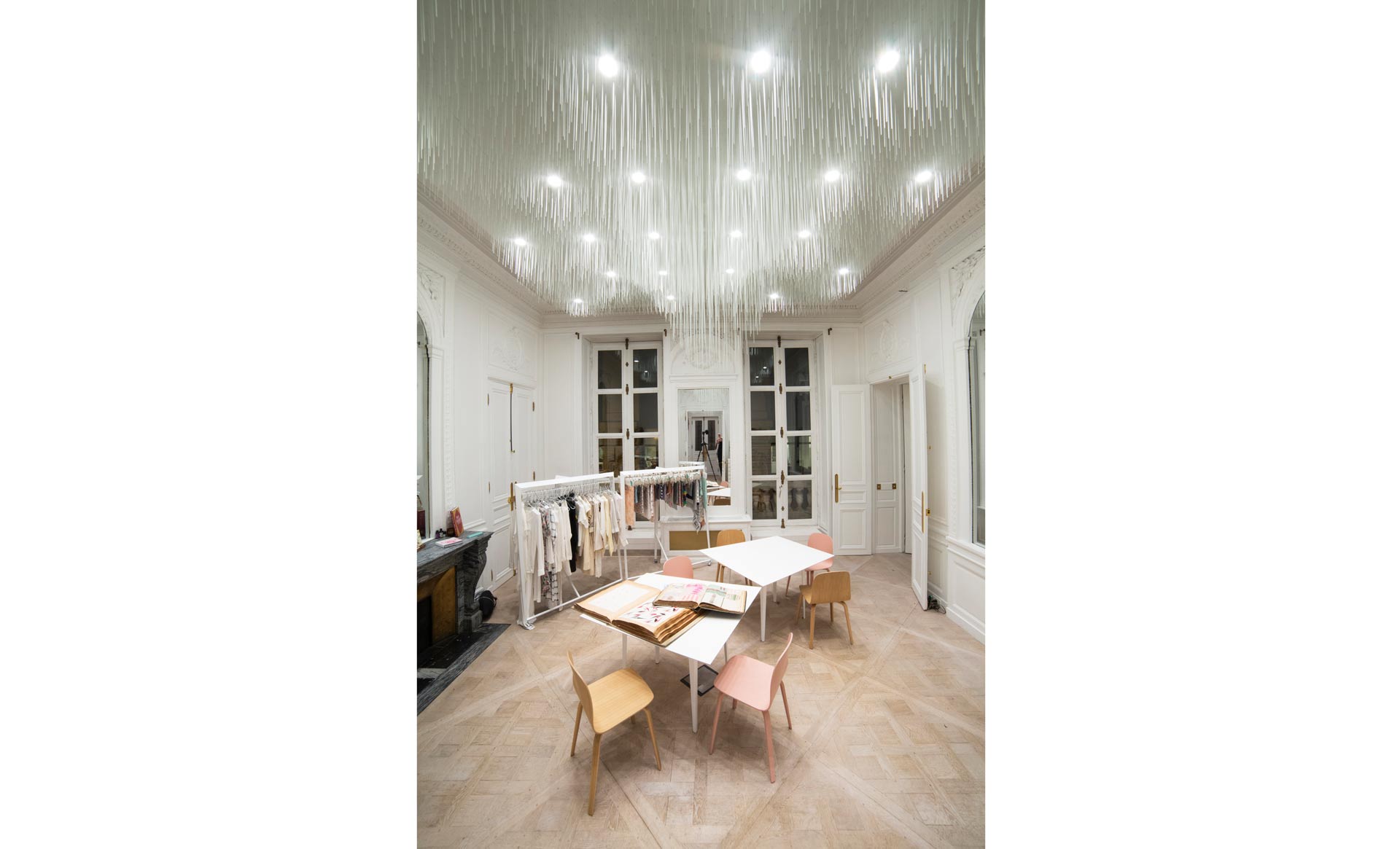
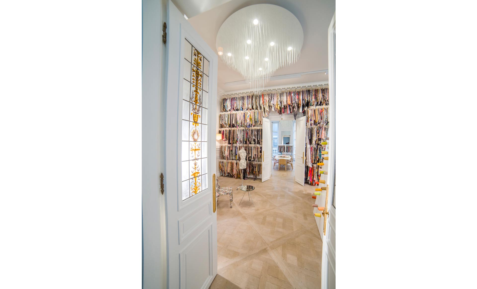
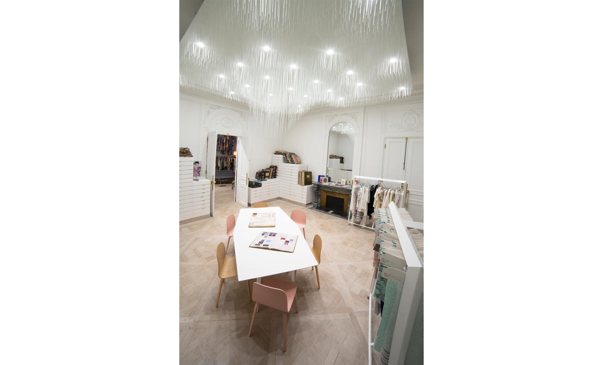
Paul Coudamy has landed the new Parisian showroom for the style and textile design agency Lizybiz. With 170m2 to play with in one of the capital’s classic 19th century buildings, this young French architect has met the needs of a studio exclusively devoted to textiles. ”My priority was to make the furniture blend in with the walls, blurring the boundaries of the forms and therefore minimizing the impact. The unique nature of the ceiling work provides intimacy while placing the spotlight on it, it diminishes the feeling of height in places and subtly prevents the architecture from being intimidating without distorting it,” resumes Paul Coudamy who has produced a monumental, yet light installation suspended in the space, a functional structure as well as a visual object linking the Haussmann era with contemporary style.
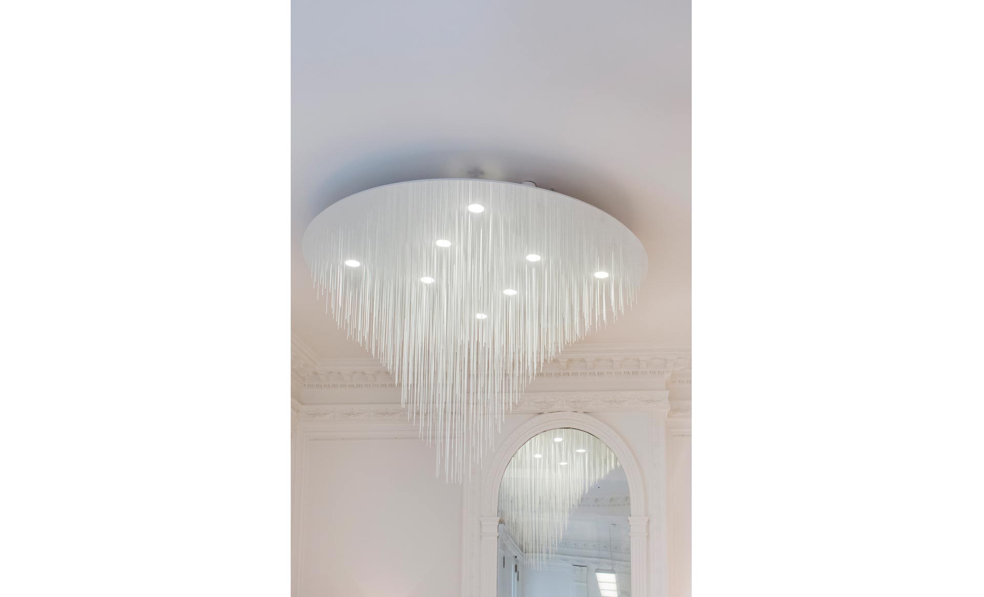
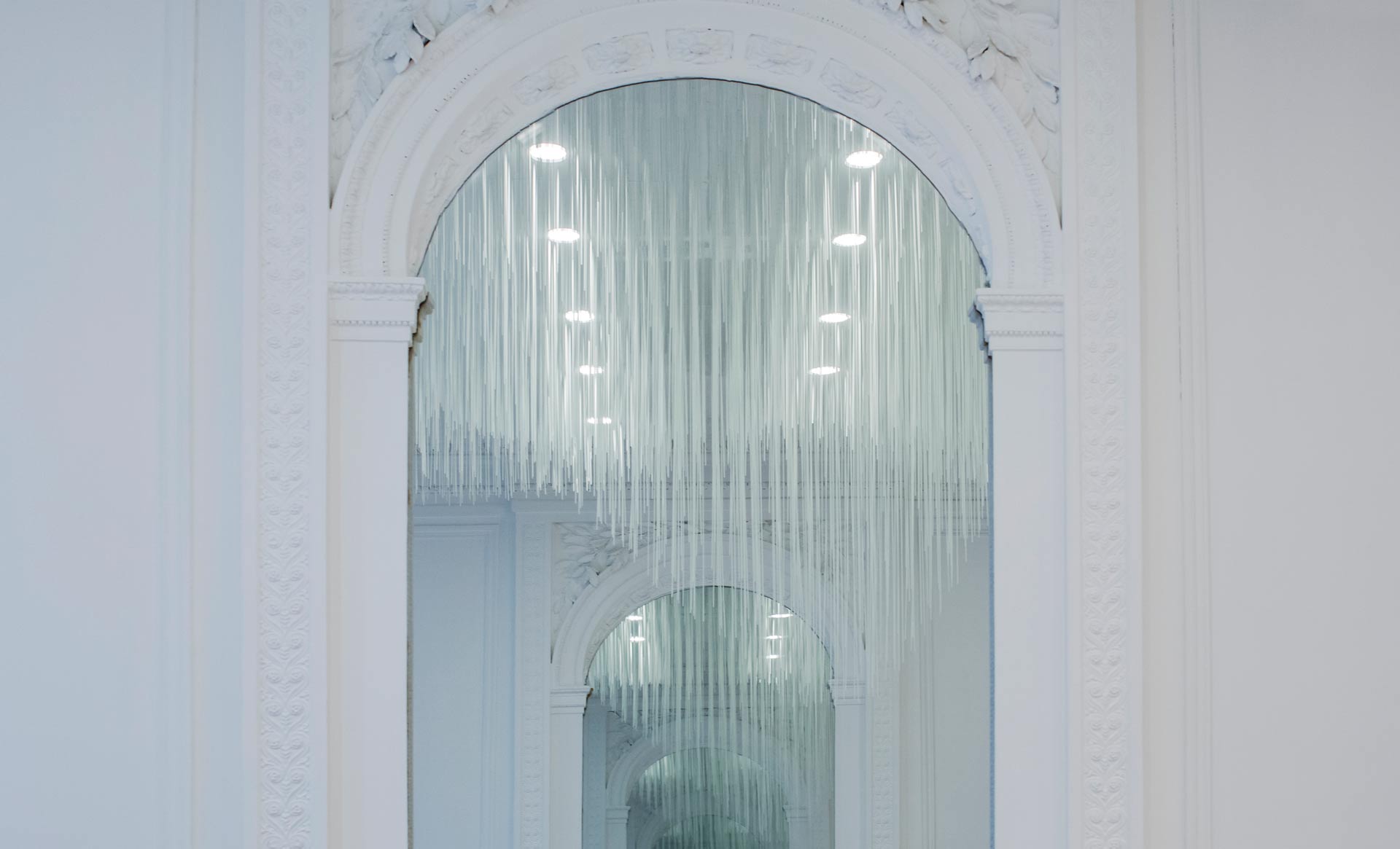
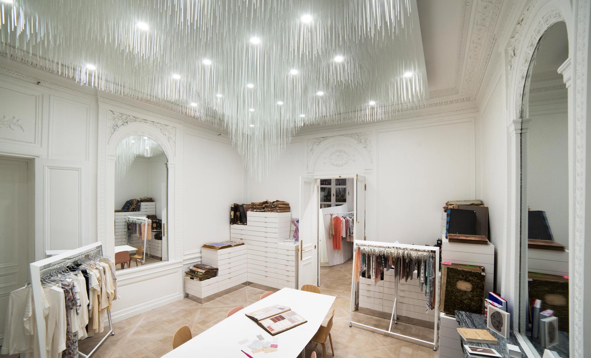
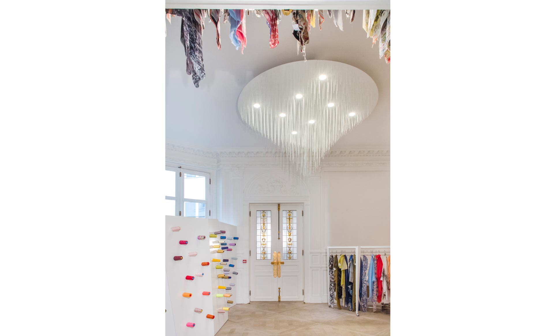
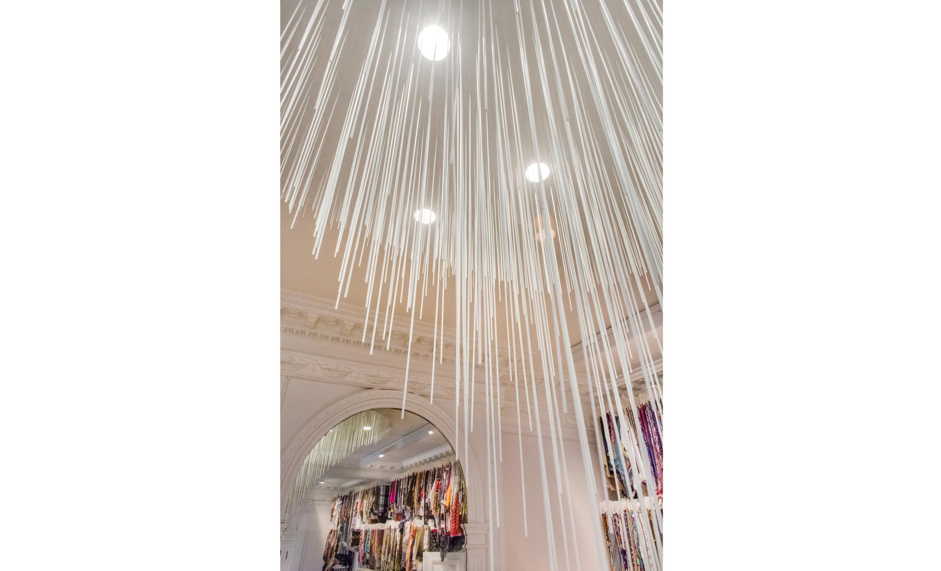
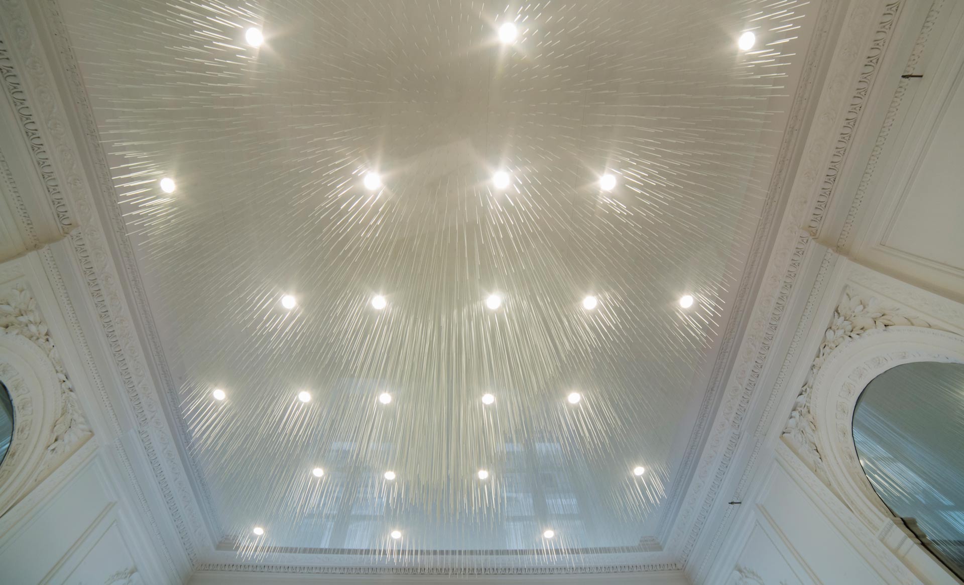
The Volatiliz ceiling light design looks like an inverted forest, a field of grass descending from the ceiling at varying heights to create a continuous layer undulating in the space. “Perceptible and transparent, these very slender stems dispersed over the smooth ceiling flirt with the integrated light, allowing a free perception of the space.” Suspended on lacquered panels, 2.6km of fibreglass stems were required to compose the showroom ceiling light covering a total of 20m².
The furniture design is based on a triangular structure.” Visually the profile is extremely refined yet it remains very stable and solid. This design enables the section approaching the ground to be slimmer. The furniture hovers, resting on its ultra-slim feet like insect legs.”
Reduced to a bare minimum the rails on wheels disappear behind the clothes and fabrics with a double configuration, presenting both a front and side view. The tables designed in three sections enable many configurations: straight, curved, split up into three parts or L-shaped suitable for presentations and work sessions. The thickness of the table surface is not obvious due to it being partially bevelled. The feet that narrow as they approach the ground reinforce the feeling of lightness and floating. This disconcerting finesse contrasts with the solidity of the broad white top.
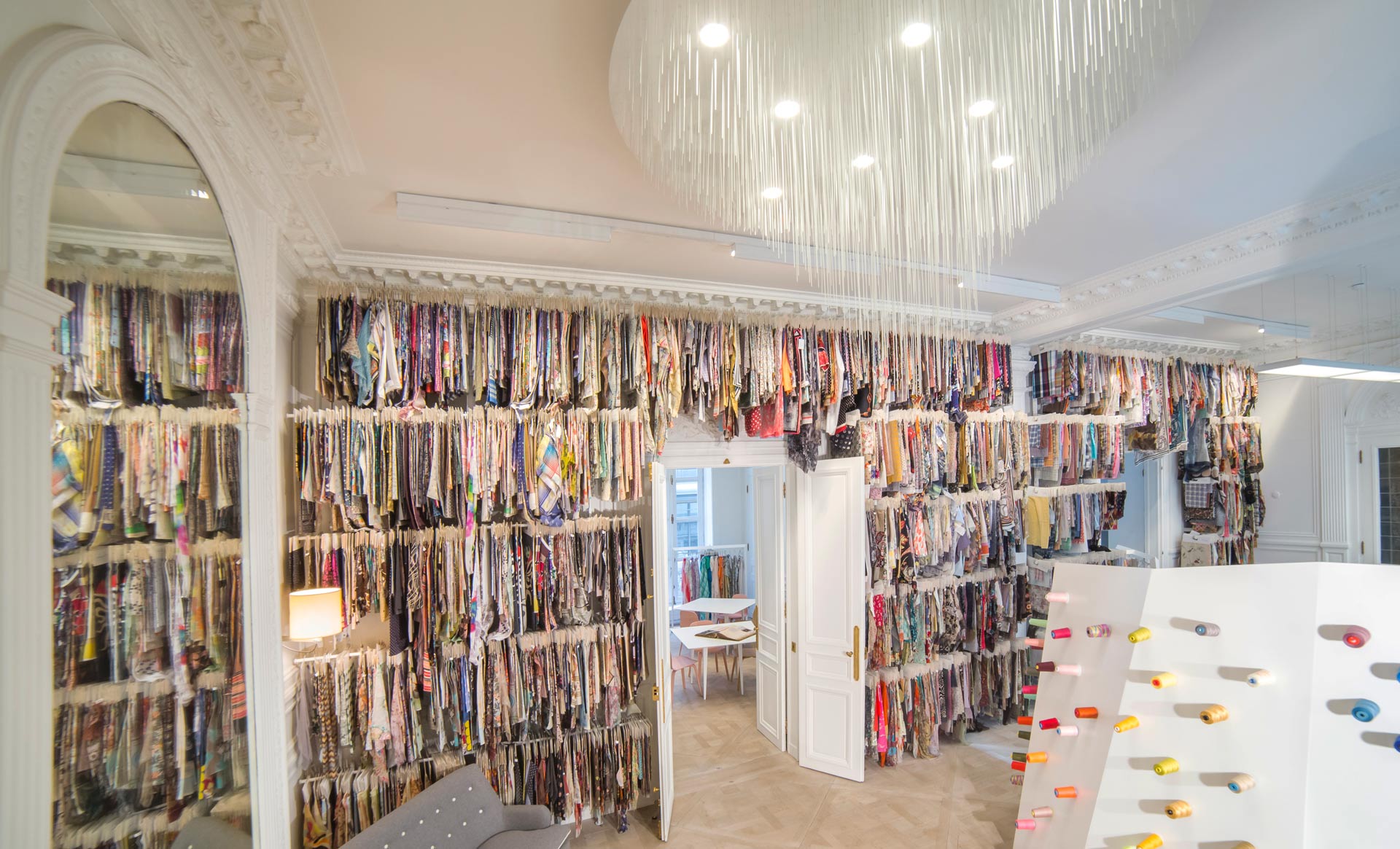
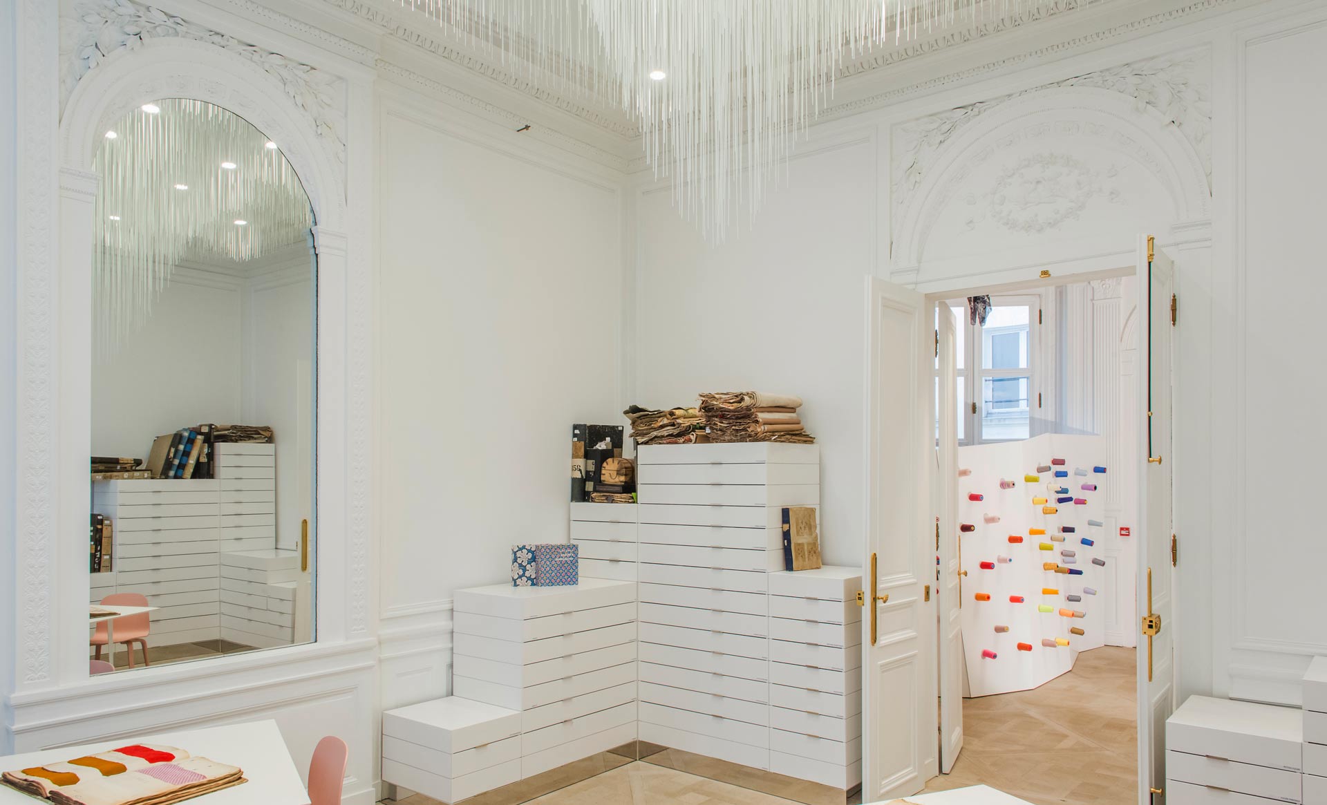
There is particular attention to detail regarding the design of the drawer units. “It was important for the presence of the storage furniture to be subtle in order to retain the equilibrium of the space. The drawers are like stratum, a landscape of cubes that evolves at different heights. A fine engraving on the external surface clarifies the interpretation of the drawers. The entire volume is grooved with layers that blend with the drawers and reflect the moulding. The range of heights provides additional surfaces to sit, settle down and consult books or spread out fabric next to a nearby table. A mirror polished steel skirting board provides a disconcerting lightness by visually lifting the mass of unpolished, white lacquered wood from the parquet.” The partition in the main space is like an angular slanting form. Once in the reception area visitors notice this mysterious shape, a geometrical rock displaying coloured threads. The structure fully opens and provides storage on the other side.
Lastly, the company archives are at the heart of the workspace. Samples become an architectural material highlighting the lightness of the ceiling.
